 |  |  |
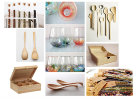
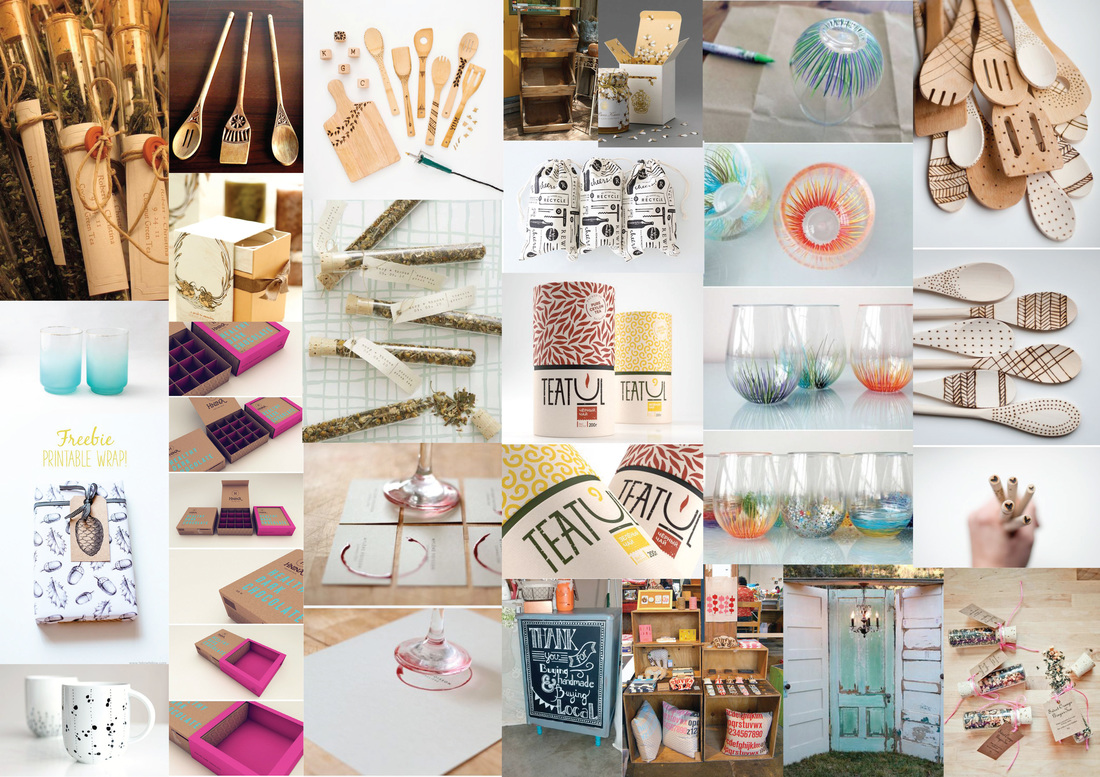
The concepts for the market stall, products and packaging have changed slightly since initial discussion as the group took a deeper look into the meaning of the brand identity we wanted to create and the feel of the market stall. The initial idea was to reflect a homely feeling through structure and design of the market stall along with packaging that showcased pop colours. This has changed as the brand identity was further developed over the weeks. The concept is much more simplistic and structured now as the use of pastel colours paired with a minimalist logo and stall concept reflects this.
The brand identity is reflected in the name of the brand, packaging, colour palette, stall design and products. The brand name “Nest” represents the notion of a safe oasis of the home and structural elements of a bird’s nest in nature. As discussed in the presentation, the complexity of a bird’s nest structure is hidden by the simplistic overall appearance. Similarly, our concept reflects this as a great deal of detail and symbolism has been created to form a strong brand identity. Though this is the case, an onlooker may not be aware of this as the overall visual appearance of the market stall, products and packaging is quite simplistic.
An idea further developed after discussion during the presentation was the idea of each team member representing a type of bird. This was thought of after the group discussed the brand name and how each bird species creates their own individual and unique nest despite similar appearance. This is reflected in the team members, as despite us all having different personalities and products, they work well together because they use similar natural materials of glass and wood. This idea of each being individual birds could be further developed as different bird symbols could appear on each of our products as a trademark symbol. Despite the birds being different in appearance, the symbolism will allow customers to connect with the brand and tie all of our products together.
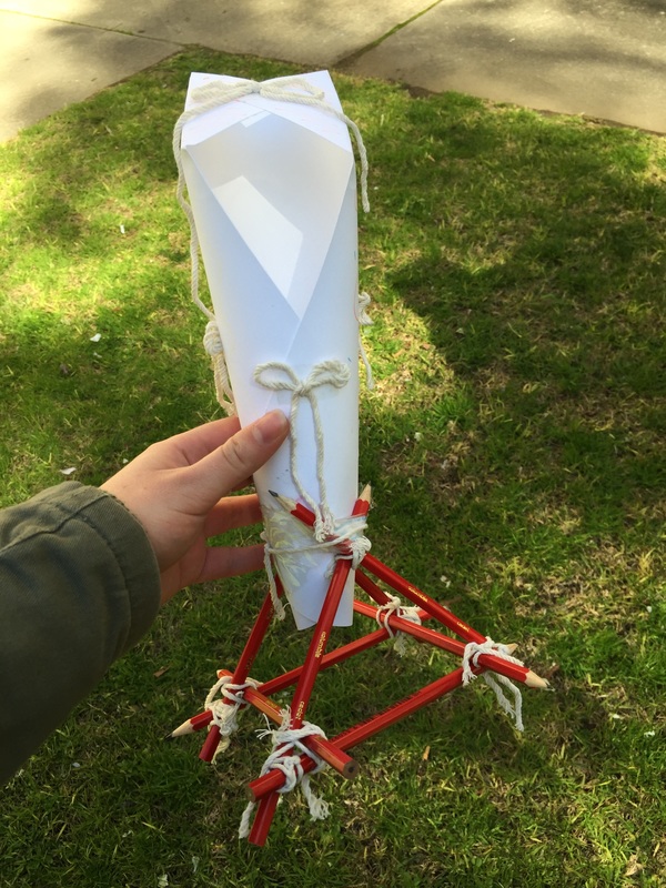
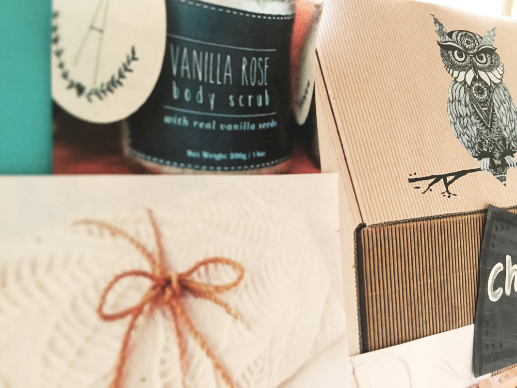
| Another suggestion made after the presentation was to further develop the packaging ideas by making sure the protection of the glass products is a high priority. A recommendation of making a “nest” appearance with various materials sitting at the bottom of a box packaging would assist in protection and add emphasis to the brand identity. This idea was further developed, as it is crucial to support the glass product in packaging that is supportive. As shown in figure 1.0, I want to take a further look at adding a hay or straw stuffing to the bottom of the box to allow the glass to sit amongst the cushioned packaging. The hay will effectively secure the glass whilst appearing as though the product is sitting in a nest structure. | 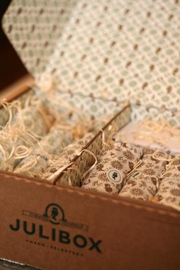 Figure 1.0 |
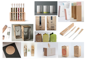
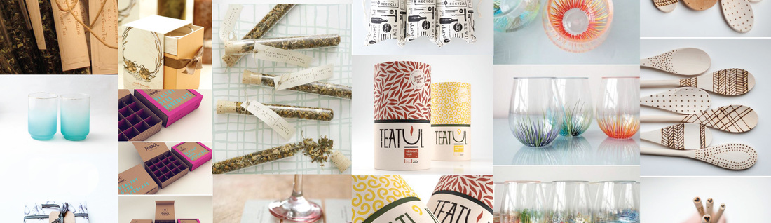
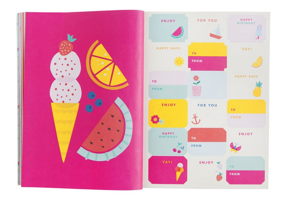
An element of packaging the group are focusing on is the concept of gift giving. This is the case as the market will be held roughly a month before Christmas. The timing works well as the market will be an opportunity for the target market to purchase a product as a gift. The group focused on creating swing tags to draw emphasis on this idea as the tag will show the brand name and allow the buyer to write who the gift is to and from. This idea was further developed after the discussion as an idea of a gift-wrapping station was suggested. The idea was to offer and encourage customers to make a further purchase of $1.00 or more in order to get the product gift-wrapped. This adds a personalised touch to the packaging and promotes a positive customer experience. The idea of gift-wrapping will be further discussed with the group, as the idea can potentially create a higher profit for the stall.
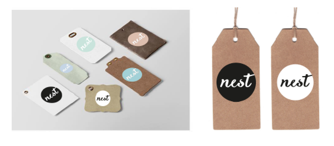
Swing tags design
Lastly, the structural elements of the stall concept were discussed as the current concept is too small for the market. The stall was inspired by a natural rock foundation and shows a built up interconnected layer structure. The idea and feel of the stall will remain the same however the concept will be tweaked to adjust the scale. By adding spacing between elements, the stall will grow in height and be more realistic in size. After the suggestion made in class, the group discussed raising particular elements and adding stable leg stands between them to further develop the size of the stall whilst keeping the same concept.
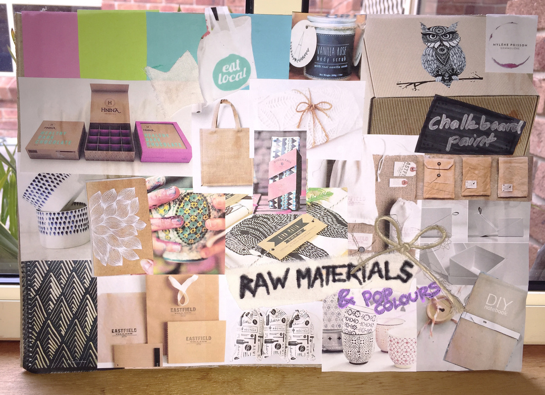
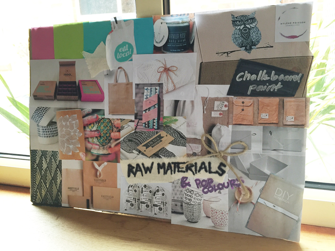
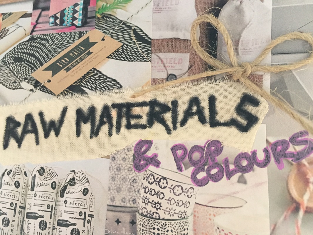
 Market stall mood board | 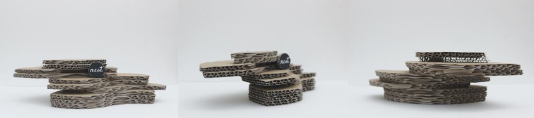 Market stall concept |

 RSS Feed
