How does packaging indicate brand value?
Compare two brands and how they use packaging to indicate value and price point. Chose one high-priced brand and one low-priced brand and compare/contrast the use of packaging.
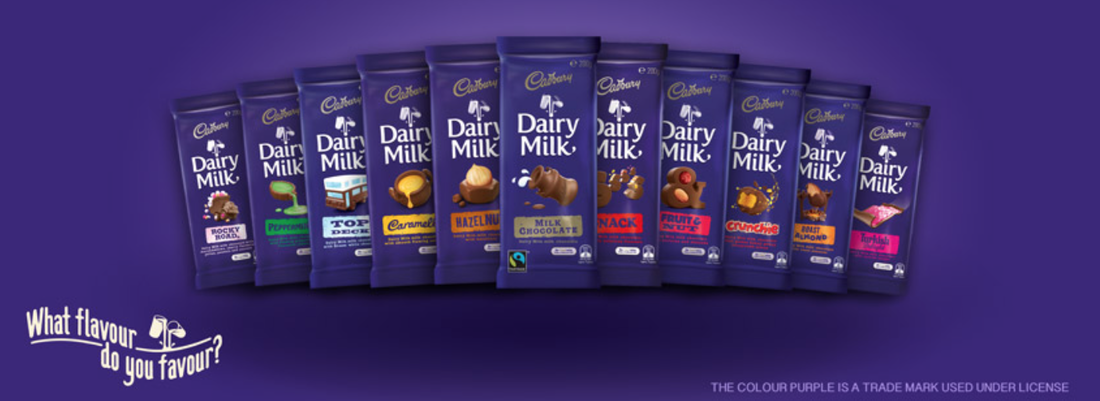
Koko Black is known for its luxury, high price point, and dedication to providing customers with detailed designs and decadent chocolates. Going to and purchasing from Koko Black stores is all about the experience. From the moment you walk in the store, you are taken back by the dark chocolate appearance of your surroundings and indulgent selection of sweets. Koko Black believes “chocolate has the ability to take us somewhere” (Koko Black. 2015). In comparison, Cadbury chocolate is known for its bright purple, rectangular block packaging, multiple flavours, sale price point and excitement. The company’s slogan reflects their brand values as they ask a question to customers of “what flavour do you favour?” (Mondelez Australia. 2015). Cadbury chocolates started off as a luxury product in 1824 in Birmingham, England as the elite of England were the only ones who could afford it (Mondelez Australia. 2015). It was here John Cadbury first started selling sweets that contained cocoa and drinking chocolate (Mondelez Australia. 2015). The first blocks of chocolate in 1849 did not contain the same ingredients as today’s chocolates contain however, with the advancement of technology and experimentation, the well known and loved chocolate became popular within society (Mondelez Australia. 2015). Cadbury chocolate has a rich, long history in comparison to Koko Black, which began its journey in 2001. The history difference has an impact on the two companies as Cadbury has had the chance to refine their product and packaging.
What colours, typefaces, graphics does the company use on the packaging? What does this say about the value of the product?
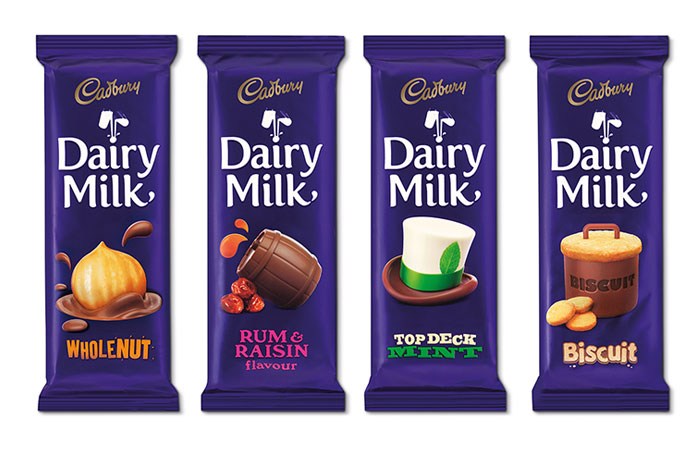
Cadbury focuses on making customers happy with their cartoon-like illustration packaging and fun flavours. Cadbury has a soft serif typeface that stands out in white from its purple packaging. The logo gives a large indication on the value of the brand as its swirled appearance indicates a fun and exciting product that is consumed amongst families. The vibrant package appearance also gives a further indication of value as the purple colouring reflects a meaning of “entertainment” and is often used to promote its products to children (Digital Skratch. 2015). The products packaging has evolved over time however remain to have a bright appearance to “help customers find their favourite bar on-shelf easily” (Nieburg, O. 2013). The colour purple used has actually become a trademark colour used under license for Cadbury products (Cadbury. 2015). In comparison, Koko Black has a sleek, structured, serif typeface that is often printed in either white or black depending on the product. Both products have used a serif typeface as it is often easier to read on printed products and promotes a feeling of “bold quality” (Chow, S. 2015). The colouring of Koko Black products gives a strong indication into the value of the chocolates as they use dark shades paired with limited bright colours of red and white. The colour scheme gives the product a feeling of sophistication, over-indulgence and a product that is bought to spoil oneself or someone else if given as a gift. Dark packaging is often used to promote a feeling of power, authority, expense and higher perceived value (Empower yourself. 2015). For this reason, Koko Black limits their colour use and sticks to producing packaging that is of a dark appearance.
Compare two brands and how they use packaging to indicate value and price point. Chose one high-priced brand and one low-priced brand and compare/contrast the use of packaging.
Koko Black is known for its luxury, high price point, and dedication to providing customers with detailed designs and decadent chocolates. Going to and purchasing from Koko Black stores is all about the experience. From the moment you walk in the store, you are taken back by the dark chocolate appearance of your surroundings and indulgent selection of sweets. Koko Black believes “chocolate has the ability to take us somewhere” (Koko Black. 2015). In comparison, Cadbury chocolate is known for its bright purple, rectangular block packaging, multiple flavours, sale price point and excitement. The company’s slogan reflects their brand values as they ask a question to customers of “what flavour do you favour?” (Mondelez Australia. 2015). Cadbury chocolates started off as a luxury product in 1824 in Birmingham, England as the elite of England were the only ones who could afford it (Mondelez Australia. 2015). It was here John Cadbury first started selling sweets that contained cocoa and drinking chocolate (Mondelez Australia. 2015). The first blocks of chocolate in 1849 did not contain the same ingredients as today’s chocolates contain however, with the advancement of technology and experimentation, the well known and loved chocolate became popular within society (Mondelez Australia. 2015). Cadbury chocolate has a rich, long history in comparison to Koko Black, which began its journey in 2001. The history difference has an impact on the two companies as Cadbury has had the chance to refine their product and packaging.
What colours, typefaces, graphics does the company use on the packaging? What does this say about the value of the product?
Cadbury focuses on making customers happy with their cartoon-like illustration packaging and fun flavours. Cadbury has a soft serif typeface that stands out in white from its purple packaging. The logo gives a large indication on the value of the brand as its swirled appearance indicates a fun and exciting product that is consumed amongst families. The vibrant package appearance also gives a further indication of value as the purple colouring reflects a meaning of “entertainment” and is often used to promote its products to children (Digital Skratch. 2015). The products packaging has evolved over time however remain to have a bright appearance to “help customers find their favourite bar on-shelf easily” (Nieburg, O. 2013). The colour purple used has actually become a trademark colour used under license for Cadbury products (Cadbury. 2015). In comparison, Koko Black has a sleek, structured, serif typeface that is often printed in either white or black depending on the product. Both products have used a serif typeface as it is often easier to read on printed products and promotes a feeling of “bold quality” (Chow, S. 2015). The colouring of Koko Black products gives a strong indication into the value of the chocolates as they use dark shades paired with limited bright colours of red and white. The colour scheme gives the product a feeling of sophistication, over-indulgence and a product that is bought to spoil oneself or someone else if given as a gift. Dark packaging is often used to promote a feeling of power, authority, expense and higher perceived value (Empower yourself. 2015). For this reason, Koko Black limits their colour use and sticks to producing packaging that is of a dark appearance.
What materials are used in the packaging (ie. card stock, foils, specialty papers, print treatments)? What do the materials tell you about the product value?
Cadbury chocolate is presented and stored in a glossary foil package that makes it easy to open, consume the chocolate and wrap it up again if wanting to save the chocolate for a later time. Foil packaging has been used to prevent cocoa butter from exposing through to the outside (Levine, R. 2015). The foil packaging wrapped around the chocolate block “protects against loss of flavour and moisture” sustaining the rich chocolate flavour between consumption (Amcor. 2015). The gloss appearance gives an indication of product value as despite the gloss appearance catching ones attention, the package can also look quite cheap. Cadbury packaging did change to have a cardboard box exterior at one point to give an indication of a slightly higher price point however changes between a foil and cardboard package often. The cardboard packaging was originally produced as Cadbury’s promise to reduce 25% of packaging by 2010 (Alter, B. 2009) The cardboard exterior protrudes a feeling of holding something sustainable in ones hand as it feels much more solid than foil.
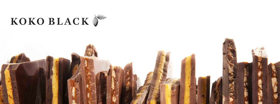
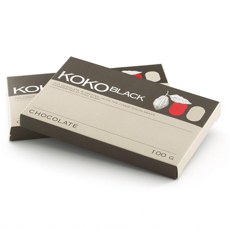
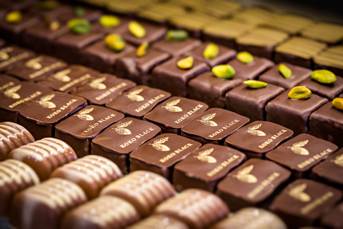
Koko Black chocolates are packaged in a variety of ways and materials depending on the product. For instance, products containing an assortment of chocolates are packed in a large cardboard box with individual compartments for each chocolate. This form of packaging provides customers with the feeling that their chocolate is well cared for and individually thought of. Another form of packaging is their chocolate blocks. Each block is wrapped in plastic to prevent loss of flavour and grease seeping through to the outer packaging. The block is then placed inside a small cardboard box that has been designed to showcase the amount of grams contained inside, company logo and product type presented on top. Though this is the case for the chocolate bar shown in image 1.0, not all products are packed with the same outside design. The packaging for Koko Black gives customers a sense of care and class as the outside cardboard appearance gives an indication of a higher price value due to its matte finish.
Cadbury chocolate is presented and stored in a glossary foil package that makes it easy to open, consume the chocolate and wrap it up again if wanting to save the chocolate for a later time. Foil packaging has been used to prevent cocoa butter from exposing through to the outside (Levine, R. 2015). The foil packaging wrapped around the chocolate block “protects against loss of flavour and moisture” sustaining the rich chocolate flavour between consumption (Amcor. 2015). The gloss appearance gives an indication of product value as despite the gloss appearance catching ones attention, the package can also look quite cheap. Cadbury packaging did change to have a cardboard box exterior at one point to give an indication of a slightly higher price point however changes between a foil and cardboard package often. The cardboard packaging was originally produced as Cadbury’s promise to reduce 25% of packaging by 2010 (Alter, B. 2009) The cardboard exterior protrudes a feeling of holding something sustainable in ones hand as it feels much more solid than foil.
Koko Black chocolates are packaged in a variety of ways and materials depending on the product. For instance, products containing an assortment of chocolates are packed in a large cardboard box with individual compartments for each chocolate. This form of packaging provides customers with the feeling that their chocolate is well cared for and individually thought of. Another form of packaging is their chocolate blocks. Each block is wrapped in plastic to prevent loss of flavour and grease seeping through to the outer packaging. The block is then placed inside a small cardboard box that has been designed to showcase the amount of grams contained inside, company logo and product type presented on top. Though this is the case for the chocolate bar shown in image 1.0, not all products are packed with the same outside design. The packaging for Koko Black gives customers a sense of care and class as the outside cardboard appearance gives an indication of a higher price value due to its matte finish.
The last indication of product value is where each product can be purchased. Cadbury chocolate is available at multiple supermarkets and grocery stores around the world. Because they are easy to find, a lower price point is indicated. Koko Black chocolates can only be purchases from Koko Black stores. For this reason, they are much harder to purchase because one has to attend the individual stores to make a purchase.
References
Alter, B. (2009). Cadbury’s gives up the tin and turns to cardboard. Retrieved 19/08/2015 from Treehugger website: http://www.treehugger.com/corporate-responsibility/cadburys-gives-up-the-tin-and-turns-to-cardboard.html
Amcor. (2015). Chocolate Bar Foil. Retrieved 19/08/2015 from Amcor website: http://www.amcor.com/products_services/chocolate_foil/
Cadburdy. (2015). The Story of Cadbury. Retrieved 19/08/2015 from Cadbury website: https://www.cadbury.com.au/About-Cadbury/The-Story-of-Cadbury.aspx
Chow, S. (2015). Typography II: 4 Things you need to know to pair fonts well. Retrieved 19/08/2015 from Piktochart website: http://piktochart.com/typography-things-you-need-to-know-to-pair-fonts-well/
Empower yourself. (2015). Packaging Colours. Retrieved 19/08/2015 from Empower yourself with colour psychology website: http://www.empower-yourself-with-color-psychology.com/packaging-colors.html
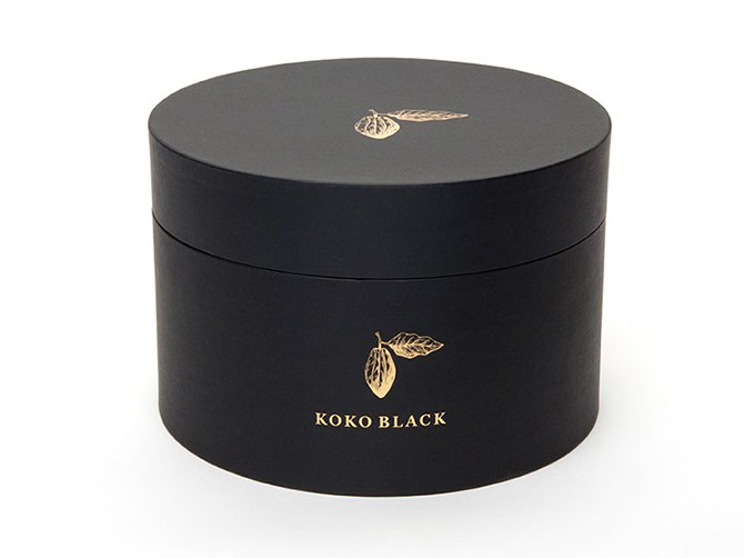
Koko Black. (2015). Koko Black. Retrieved 19/08/2015 from Koko Black website: http://www.kokoblack.com/shop/shop/gift-boxes.html
Levine, R. (2015). Why is chocolate rarely wrapped in foil and paper these days? Retrieved 19/08/2015 from Quora website: http://www.quora.com/Why-is-chocolate-rarely-wrapped-in-foil-and-paper-these-days
Skratch. (2015). Colour has the ability to influence emotions in a way that few other mediums can. Retrieved 19/08/2015 from Digital Skratch website: http://www.digitalskratch.com/color-psychology.php
Alter, B. (2009). Cadbury’s gives up the tin and turns to cardboard. Retrieved 19/08/2015 from Treehugger website: http://www.treehugger.com/corporate-responsibility/cadburys-gives-up-the-tin-and-turns-to-cardboard.html
Amcor. (2015). Chocolate Bar Foil. Retrieved 19/08/2015 from Amcor website: http://www.amcor.com/products_services/chocolate_foil/
Cadburdy. (2015). The Story of Cadbury. Retrieved 19/08/2015 from Cadbury website: https://www.cadbury.com.au/About-Cadbury/The-Story-of-Cadbury.aspx
Chow, S. (2015). Typography II: 4 Things you need to know to pair fonts well. Retrieved 19/08/2015 from Piktochart website: http://piktochart.com/typography-things-you-need-to-know-to-pair-fonts-well/
Empower yourself. (2015). Packaging Colours. Retrieved 19/08/2015 from Empower yourself with colour psychology website: http://www.empower-yourself-with-color-psychology.com/packaging-colors.html
Koko Black. (2015). Koko Black. Retrieved 19/08/2015 from Koko Black website: http://www.kokoblack.com/shop/shop/gift-boxes.html
Levine, R. (2015). Why is chocolate rarely wrapped in foil and paper these days? Retrieved 19/08/2015 from Quora website: http://www.quora.com/Why-is-chocolate-rarely-wrapped-in-foil-and-paper-these-days
Skratch. (2015). Colour has the ability to influence emotions in a way that few other mediums can. Retrieved 19/08/2015 from Digital Skratch website: http://www.digitalskratch.com/color-psychology.php
 RSS Feed
