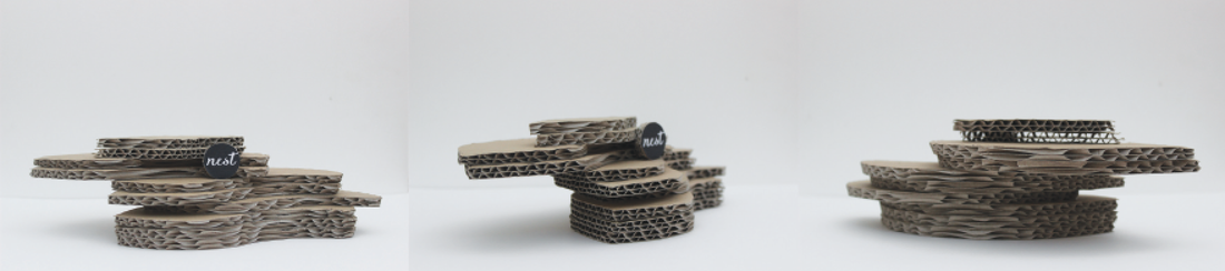
The brand “Nest” was selected to reflect the complex structure of a bird’s nest hidden by the simplistic overall appearance. The concept for the market stall is to produce unique products tailored for the home, presented in detailed packaging. The overall market stall concept is reflected in the name of the brand as the “nest” identity symbolises a homely and safe oasis feeling. The meaning of the brand identity was an important element of the market stall as it has the potential to influence customers’ perception of the brand, products, packaging and stall. The minimalist approach to design of the market stall will effectively help promote the products, as the simplistic stall design will entice the attention of onlookers. The detail of packaging (brand sticker concept, swing tag element and colour palette) will encourage customers to leave the stall feeling as though they have had a positive market experience.
For a detailed explanation of the target market, stall concept, product, packaging and brand identity, view the presentation displayed below.
For a detailed explanation of the target market, stall concept, product, packaging and brand identity, view the presentation displayed below.
 RSS Feed
